Topics: Front End Development, UX Design, UI Design, TTRPGs
Stack: HTML, Javascript, Typescript, React, ShadCN
Background
Every Sunday I play in a tabletop RPG group that we call Round Table. In that group we each take turns running different games, and recently we have switched over to playing Pathfinder 2nd Edition. We each take turns as Game Master and player in that group, usually switching off every few months. This system is brand new to many of us, including me. I love the system so far, but it is pretty complex learning it for the first time!
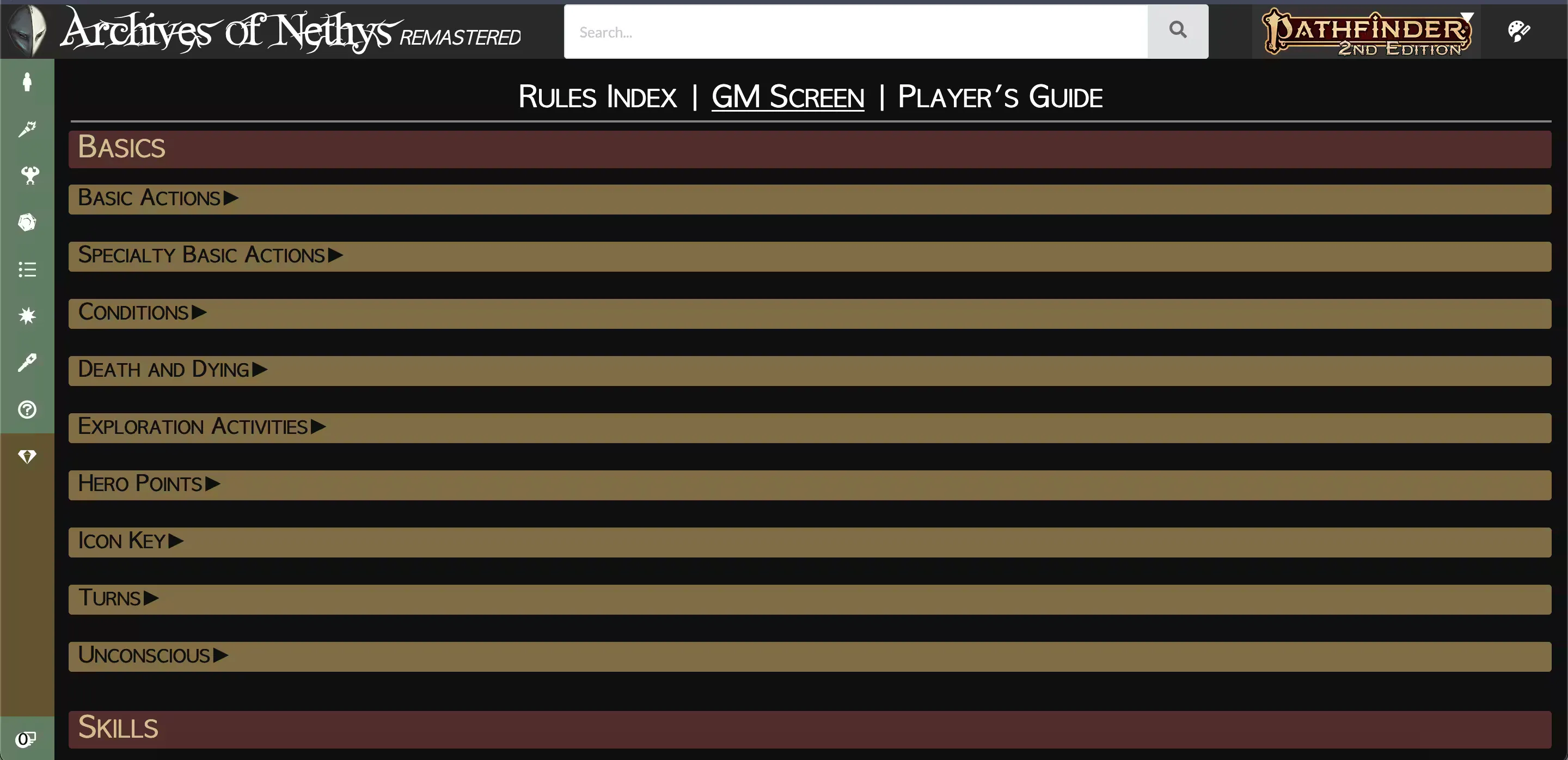
Paizo, the makers of Pathfinder, are quite generous in how they distribute their rules in that they support a free reference for every rule, monster, class, and pretty much everything else on a searchable website, Archive of Nethys. This is an amazing resource to have while running a game because every rule can be looked up very quickly. Still, there are certain things that come up very often in the game that can be hard to memorize, and they come up so often that I wouldn’t want to look them up every time. In the olden days of Game Mastery, before virtual table tops, Game Masters utilized a physical GM screen, typically a trifold piece of cardboard that stands upright. The screen provides a barrier between the Game Master and players to obscure the GM’s nefarious plans and dice rolls, but they also serve an extremely useful function of being a quick reference. They typically include things like basic turn structure, combat actions, common yet tricky rules, and various tables to randomly generate loot or encounters when needed. Archive of Nethys features a GM screen page that serves to work as that same quick reference, but I have a few problems with the layout.
Problems with Archive of Nethys’ GM Screen

My first issue with this GM screen for me is that at a glance I do not get any useful information. Everything is hidden inside of a zippy. A Game Master if often needing to use a reference like this to come up with information within a few seconds; it can really break the flow of combat or narrating a scene to fumble around looking for a rule.

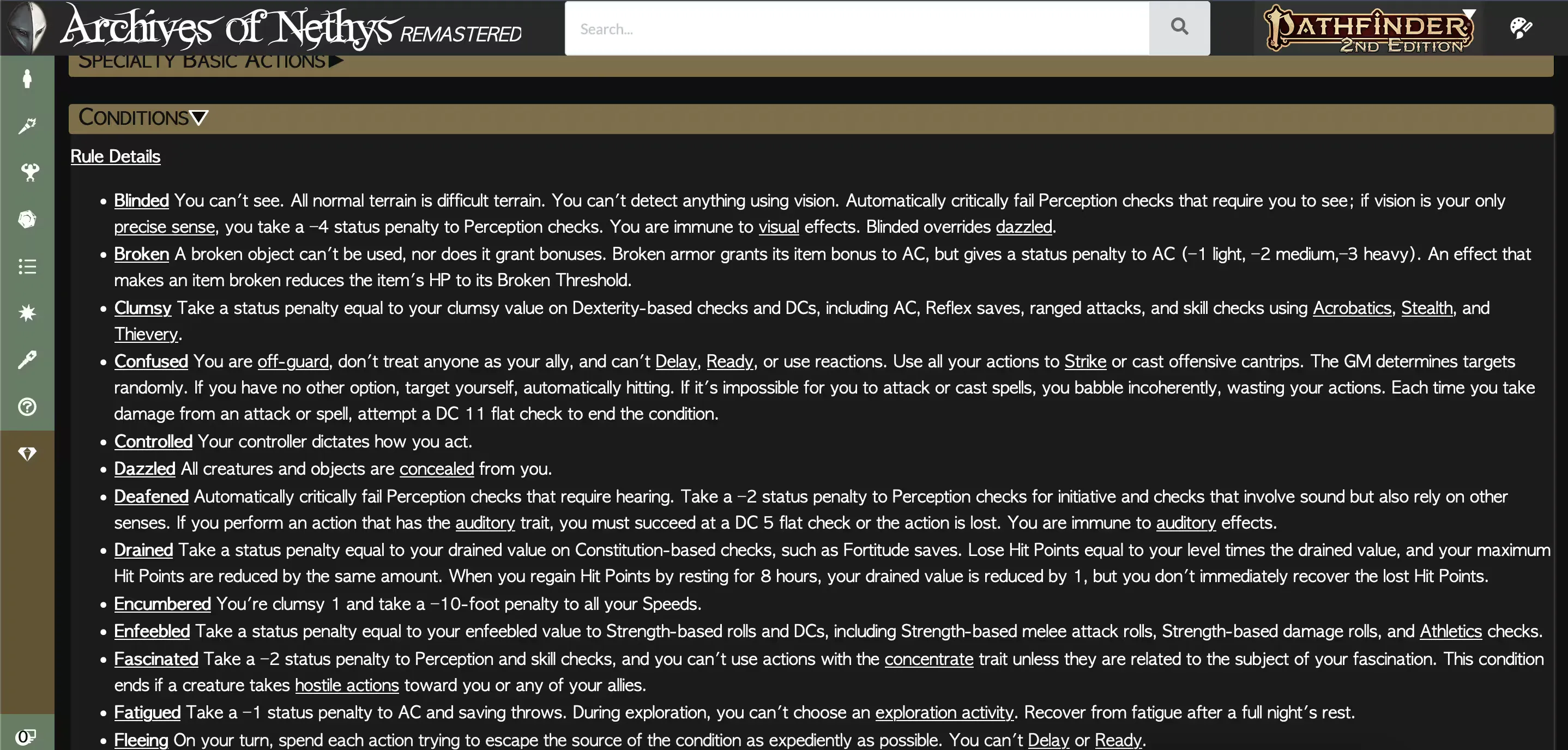
My second issue with this format is that once you expand the dropdown, the information is presented in an extremely dense way, and the rest of the information under it is pushed down. Some of the information presented I would argue isn’t necessary, and could be summarized to save space. In a traditional physical GM screen, the information is all viewable at the same time, with “cards” of reference material. Since it’s just a quick reference, it assumes that you are already familiar with the rules of the game, the GM just usually needs to reference the specifics. I know the Clumsy condition makes you slower, but was it 5 or 10 feet slower?
My final major issue with the Archive of Nethys page is that there is just too much information presented, which clutters the interface. The “Icon Key” zippy contains a reference of the icons used for actions. This is irrelevant because they’re pretty obvious, and the GM should already be very familiar with them by the point they need a GM screen. “Material Statistics” is questionable because it seems like something that doesn’t come up very often. Not once in my several years of running tabletop games have I needed a quick reference on how much HP a glass block wall or an anvil has. If it did come up it would most likely be planned ahead of time, where a quick reference isn’t as needed, or I would just make a number up on the spot, or I would look up the rule if absolutely necessary.
Rethinking the UI
My analysis of the Archive of Nethys GM screen gave me a few ideas for how I want to display the information.
- It should be as fast as possible to get the information that you need as a GM quickly.
- The information should be prioritized and relevant. The most important information should be the most obvious, and extra “flavor text” should be removed if it does not impact clarity.
- The information should be able to be cross-referenced easily, like comparing the encounter budget (how many monsters the party can take on) with the monster’s XP (determines how much a monster costs in the encounter budget).
Technology Stack
For this project I wanted to get a working and functional web app up and running as fast as possible. The UI I was envisioning wasn’t anything groundbreaking, it was supposed to be familiar and relatively boring. I also wanted to try out some ready-made UI components anyway since I was wondering how much time they would really save in creating my UI.
I chose ShadCN for UI components. ShadCN is based on React, Tailwind, and Typescript, so those were of course also part of my front end stack. I chose ShadCN because the components looked nice, it had components for my use case (mainly cards, tables, and tabs), and I was already familiar with React and Typescript so that would let me hit the ground running.
Tailwind
Tailwind has been on my radar for quite awhile. I’ve generally dismissed it as a tool that probably makes sense for large teams and didn’t make much sense for me to use in my solo work. If you’re in a team that has developers that aren’t very familiar with CSS and design, Tailwind probably makes everyone’s life easier in the end. I can also see it being used in very complex interfaces (from lots of differently styled elements) that change frequently, the biggest advantage I see is maintainability.
From my experience with Tailwind in this project I wasn’t really a fan. I’m generally not a big fan of CSS resets that touch too many default styles. I actually do want <strong> to make text bold out of the box, and I do want <h2> to make text bigger. I might change what specific size each heading level has from the default, but it’s just adding more typing to have to re-apply the font size to the element after normalizing the style. Typing <strong className="text-bold"> feels wrong, and typing <h2 className="font-bold text-3xl"> every single time gets repetitive, and doesn’t feel very DRY.
I still prefer semantic CSS overall, but I will continue experimenting with Tailwind. Maybe after a few projects it will start to click.
React
I enjoy React quite a bit. I appreciate that it’s a library you can use as needed. For the most part, it works with HTML, Javascript, and CSS, without trying to replace them. If I don’t need React-specific features for a component I can just write the whole thing in normal HTML. Components and JSX are both great to work with, and can save a lot of time and effort when building even a simple static page.
ShadCN
This was my first time using ShadCN, and I did like it! ShadCN allows one to copy and paste React components from their website to use directly in my own app. The UI elements are pretty basically styled, but I also have full control over them and can style them as needed, and I can pick and choose which components I want to use and which parts of those components are used.
I probably would not use ShadCN for a highly designed app that I wanted a specific look and feel for. For this project though I had no regrets, it saved a lot of time on UI elements such as tabs and tables, and the style of the components only needed some slight tweaking.
Custom Components
Color Themes
Early on in the development process I received some feedback about my choice of colors. Specifically one user said they cannot see the color purple so they would like different color theme options.
Hue Rotation
I went through a few different methods of changing the website’s color theme. My first naïve approach was to add a button to the top right of the screen that hue rotated all of the colors on the page by 45 degrees each time it was pressed, which gives 8 different color themes.
document.body.filter = "hue-rotate( " + rotationAmount + "deg)";
This worked okay, but with a few annoyances:
- There was no way to rotate the hue back, so if you wanted to settle on a red color theme and accidentally clicked too many times you had to keep clicking the button until it rotated back to what you wanted.
- There wasn’t a way to preview the color theme options, and it wasn’t really clear exactly what clicking the button did besides change the color theme in some way that may seem random.
- Since I was applying the hue rotation to the entire page, everything including the color changer button itself was changing in color, which was really distracting and would potentially be an issue later if I added any images to the page, since they would also be hue shifted.
- The button was really ugly on mobile.
I thought this would be a clever and quick solution, but it ended up not really working out very well. I tried a few variations of this to try and make it better on mobile at least, but it quickly became apparent that it wasn’t worth investing the time in this UI element. So I went back to the drawing board.
Settings Tab
I already have tabs in my UI, so why not add another for the color changer? That would also give me a space to add any other settings I might want to add later as the project increases in scope and gets more fleshed out. This solves the issue with the mobile color button being ugly, and with more room I can make a UI component that gives clearer feedback to the user on what they are selecting and what the color theme options are. It also gives me more flexibility on what color options are there, like if I wanted to add light themes that can’t be accomplished with a simple hue rotation.
I also took this opportunity to not just rotate the hue, but replace all of the colors on the page with new ones manually, giving me more control over what changes color and what it changes to.
The initial color theme I was using was created with colorffy. I like this tool because it automatically generates a good amount of color options as CSS variables while allowing a good amount of customization. I took the colors generated from colorffy and added them as variables to :root so that all elements on the page can access them.
:root {
    --clr-primary-a0: #8c31f2;
    --clr-primary-a10: #9c4cf4;
    --clr-primary-a20: #ac64f6;
    /* ... */
}
This approach to managing colors and limiting my options makes the user interface feel more cohesive and makes my code much more DRY, since I’m not copy/pasting colors between CSS classes or creating new colors on the spot every time I need a new color.
Results
Check out my Pathfinder 2e GM Screen live!
This project will continuously be added to and improved as I get feedback from other users and learn more about Pathfinder.